week #1
So... What is this frontend all about?
Well, in short it is what you see and interact with on a website.
We learned, the basics of a basis of HTML and CSS and started using Visual Studio Code.
hello dude, welcome to my
I am
a frontend dev
So... What is this frontend all about?
Well, in short it is what you see and interact with on a website.
We learned, the basics of a basis of HTML and CSS and started using Visual Studio Code.
We learned about what to use HTML, CSS and JS for and created our first ever website.
Devtools in a browser are suberb, use them more often.
Here you have layers of a website:
Every layer have an impact on one another. The highest layer of all can manipulate these lower ones. So JS is like a master of them all, but at the same time it's the hardest to learn. Nothing for free i guess.
CSS is used to make HTML pretty.
HTML is a sceleton of the whole site.
"If we can create something using HTML, we do it in HTML instead of JS"
And the last one is content of the website.
KANBAN!
We use Trello to have control of what is done and what to do next. There are three general cards:
but there is no problem adding another ones. Just these three are crucial.
Fundamental HTML tags:
<header></header> header marker (top part)
<main></main> main marker (middle part)
<section></section> used to wrap a lot of content
<article></article> used to divide section into smaller parts
<footer></footer> footer marker (bottom part)
<h1-h6></h1-h6> headings (must have in each section)
<p></p> paragraph
<br> next line
<br /> can be used s well
<b></b> bold
<i></i> italic
<strong></strong> bold, but with higher importance
<em></em> italic, but with higher importance
<a href="#" target="_blank"></a>
link leads to a link or section with href="#"
and opens in new tab with target="_blank"
<nav></nav> is used to create navigation
<img src="" alt=""> for images
to place image use src=""
and print a text of an image with alt=""
A story about a snake, kebab, camel and Pascal (no need to explain)
Selectors:
<p class="one" id="two"> we use classes as many times as we want, but id's should be used once.
.one {
color: #434343;
}
we use . before classes in CSS
#two {
color: #525252;
}
we use # before id's in CSS
CSS specificity:
(_, _), _, _, _
Left to right is here top to bottom:
DOM is the final code rendered on a website.
Terminal:
cd - home catalog.
ls list catalog content.
cd .. go to previous catalog.
cd <catalog-name> go to catalog with its catalog-name.
code . opens Visual Studio Code in current folder.
pwd show current path.
mkdir <catalog-name> create new catalog named catalog-name.
What is Git?
Git is a free and open source distributed version control system designed to handle everything from small to very large projects with speed and efficiency.
Basic Git commands:
git config --global user.name "John Miller" setting up global user name on a machine.
git config --global user.email jmiller@example.com setting up global user mail on a machine.
git init initialize new local repository.
git status checks current commit and branch status.
git add . adds every file to stage for commiting.
git commit -m "description" commits staged changes with a description.
git commit -am "description" automatically adds and commits changes with a description.
git clone <GitHub repository link> downloads all files from GitHub (remote) repository to machine.
git push send commited changes to remote repository.
git pull get latest files from remote repository.
New HTML tag:
<div></div> is used to wrap some content inside. It doesn't have semantic meaning to it.
New CSS attributes:
display: block; sets item width to 100% and stack them one under another.
display: inline; stacks items side by side. Unable to use width: and height: properties.
display: inline-block; mix between those two. Able to use width: and height: properties.
overflow: properties:
visible; default value.
hidden; hide text inside container that it's in.
scroll; creates scroll bar(s) inside container
auto; if content fits the padding-box it behaves the same as visible; and if it doesn't it creates scroll bars.
Units:
0; no need to use units with 0.
px; pixels.
%; percent. Its value is calculated due to the container height or width that it is in.
vh; viewport height is dependent of the browser height.
vw; viewport width is dependent of the browser width.
Border in CSS
border-width: 3px; border width.
border-style: solid; border style.
border-color: #434343; border color.
border: 3px solid #434343; can be written like that in short.
border-radius: 3px; defines edge roundness.
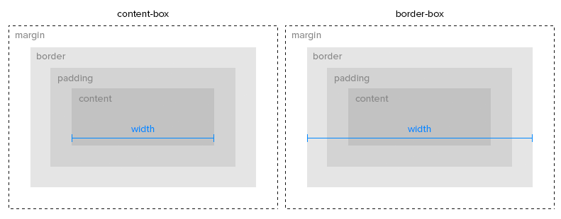
box-sizing: as in the picture below:
position: CSS property sets how an element is positioned in a document:
static; default value.
relative; The element is positioned according to the normal flow of the document, and then offset relative to itself based on the values of top:, right:, bottom:, and left:. The offset does not affect the position of any other elements; thus, the space given for the element in the page layout is the same as if position were static;
absolute; The element is removed from the normal document flow, and no space is created for the element in the page layout. It is positioned relative to its closest positioned ancestor, if any; otherwise, it is placed relative to the initial containing block. Its final position is determined by the values of top:, right:, bottom:, and left:
fixed; The element is removed from the normal document flow. Its position is fixed to the viewport and it stays there either we scroll or not.
stiky; The element is positioned according to the normal flow of the document, and then offset relative to its nearest scrolling ancestor and containing block.
float: CSS property places an element on the left or right side of its container, allowing text and inline elements to wrap around it. The element is removed from the normal flow of the page, though still remaining a part of the flow.
clear: CSS property sets whether an element must be moved below (cleared) floating elements that precede it. It applies to floating and non-floating elements.
JavaScript variables ES6
const name = 'Daniel'; variable that have constant connection between one value. Cannot manipulate these.
let job = 'jobless'; variable that doesn't have constant connection between one value. Can manipulate these as shown below.
job = 'frontend dev';
job = true;
job = 23;
JavaScript connection with DOM (Document Object Model)
document. querySelector('.some-text--js').innerHTML = 'Welcome everyone!' ;
innerHTML is used to change content of HTML in specific class chosen in querySelector()
JS functions
function sum(number) {
number += number;
return number;
}
This is a function declaration (ES5) with number as an input argument. To call this function we use: sum(10);.
This function returns a solution that we can store in a variable like this: const result = sum(10);
Then we can log the result to the console like this: console.log(result); or we can console log called function like this: console.log(sum10); the difference is that in result we stored function result and we can access it later on.
Arrow functions
We can write the same function but in different way using Arrow functions (ES6):
const sum = (number) => (number += number);
<ul></ul> unordered list. Creates lists that is not counted in any way. Dots are defaults.
<ol></ol> ordered list. Creates lists that is counted starting from '1.'.
<li></li> list item. Both <ul> and <ol> have to have list items inside just like that:
It is possible to nest lists inside like that:
<dl></dl> description list.
<dt></dt> description term.
<dd></dd> description details.
<table></table> tables. In the past developers tend to use tables to create layouts because of lack of other methods. Creating layout with it now is an occult theme and you should never do that.
Flexbox
Flexbox is used to better position elements on a page. It is more convenient to center elements and move them around.
display: flex; creating flexbox in CSS. We can now use something like this:
flex-direction:
Row is from left to right, column is from top to bottom reversed are reversed 😛.
flex-wrap:
Wrapping rows / columns.
flex-flow: <flex-direction> <flex-wrap>
Wrapping rows / columns.
justify-content:
Positioning elements along the flex-direction axis.
align-content:
Positioning rows/columns along the opposite flex-direction axis.
align-items:
Positioning elements along the opposite flex-direction axis.
align-self:
Positioning one element along the opposite flex-direction axis.
order: 0 (integer -/+)
Item order (if greater then element is higher in the hierarchy).
flex-grow: number / proportion
flex-shrink: number / proportion
flex-basis: basic size
flex: <flex-grow> <flex-shrink> <flex-basis>
Background
background-image: url('path to file')
background-position:
background-repeat:
background-attachment:
background-origin:
background-clip:
background-color: <color value>
background-size:
JavaScript logic
Comparison signs:
typeof variable Checks the type of variable. Value types:
Falsy values are the values that will always say false
Truthy values all the rest 🤘
&& AND - all conditions must be true
if ((variable === 0) && (newVariable >= 3))
|| OR - at least one condition must be true
if ((variable === 2342) || (newVariable <= 88))
! NOT - switches outcome of the logic statement
if (!(variable === 0 ))
elseexecutes code if in all above statements will be false result
if (myVariable === 4 ) {
//execute code if true
} else {
//execute code if false
}
else if executes code if in all above statements will be false result and in else if the outcome will be true
if (myVariable === 4 ) {
//execute code if true
} else if (myVariable === 8 ) {
//execute code if myVariable === 8
}
Shortend record of the if else statement with ?
(myVariable === 4 ) ? console.log('True') : console.log('False') ;
import/export in (s)css
import/export in JavaScript
webpack